
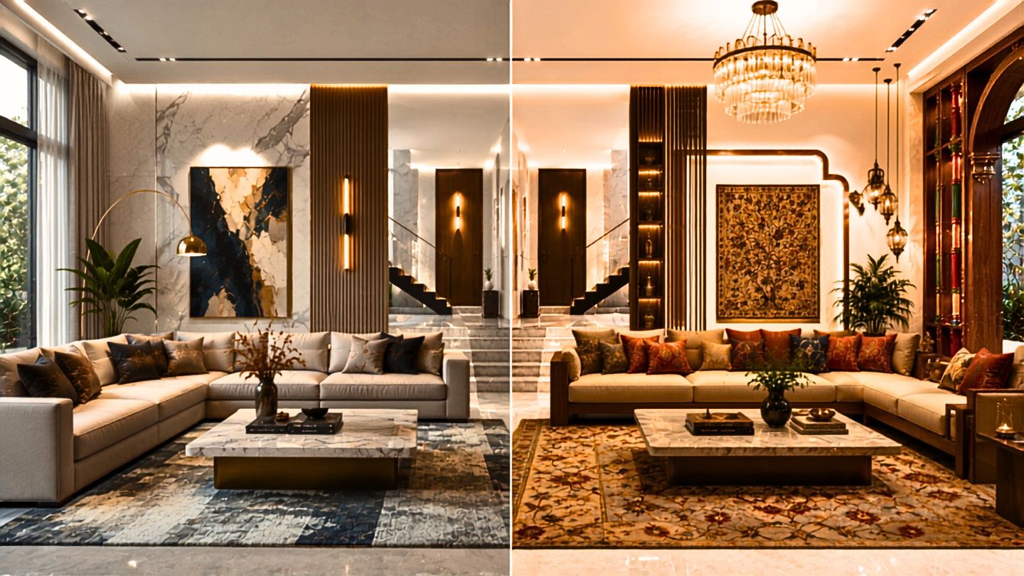
Indian interior colour trends are shifting towards warmer palettes. Discover what this means for designers, manufacturers and India’s organised interiors market.
For decades, the organised interior industry in India has looked towards Europe for design inspiration and towards global markets for material innovation. That journey has undoubtedly elevated product quality, surface technology, and manufacturing standards. Yet, as India’s organised interiors market continues to mature—projected to grow from ₹35,000 crore today to nearly ₹62,000 crore by 2030—a new question is becoming increasingly relevant: Should India also begin defining its own colour language?
Colour is far more than a styling decision. It influences emotion, purchasing behaviour, cultural acceptance, and even the longevity of a product collection. Across architecture, fashion, hospitality and consumer products, markets that build their own identity eventually develop their own palette. The Indian interiors industry is now reaching that same moment.
The Shift in Indian Interior Colour Trends
One of the clearest signals emerging from the India Interior Trend Report 2026–27 is that Indian interior colour trends are gradually moving towards warmer, richer and more emotionally connected palettes. The report identifies terracotta, mocha, warm beige, muted clay, olive, sage, walnut, deep greens and brass-inspired accents as colours increasingly finding acceptance across organised residential interiors. This shift is happening alongside the rapid rise of supermatt surfaces and high-definition textured laminates, which naturally complement deeper and more tactile colour expression.
The interesting part is that this change is not being driven by fashion alone. It reflects the personality of Indian homes. Unlike many European interiors that celebrate restraint through monochromatic palettes, Indian homes have always embraced colour as a part of everyday life. Cities themselves have become colour identities—Jaipur is recognised globally as the Pink City, Jodhpur as the Blue City, Udaipur through its whites, Kochi through earthy reds, and Kutch through vibrant craft traditions. Colour has never been an accent in India; it has been part of our cultural memory.
Why Indian Consumers Prefer Warmer Colours
Global collections have helped raise the quality of finishes available in India, but collections developed primarily for European or East Asian markets do not always reflect the emotional preferences of Indian consumers. While minimalist palettes dominated the last decade, today’s homeowner is increasingly looking for interiors that feel warmer, softer and more personal.
This does not mean returning to loud colours. It means introducing greater warmth, deeper earth tones, natural greens, heritage-inspired blues, and richer wood expressions into organised product collections.
Business truth: Products travel globally, but colours succeed locally.
As brands expand into Tier 2 and Tier 3 India, regional relevance will become even more important. A colour strategy designed for Stockholm or Shanghai cannot automatically become the colour strategy for Surat or Coimbatore.
Business Implications for Interior Brands
This presents a significant opportunity for manufacturers of laminates, decorative papers, fabrics, furniture finishes, and surface materials.
Rather than importing complete international collections, brands should begin curating collections for Indian living. European technology and finish quality can remain exactly as they are—but the colour story can become far more Indian.
For designers and studios, Indian interior colour trends should also be reflected in their sample libraries. Alongside timeless neutrals, they should consciously introduce a stronger range of warm woods, earthy solids, muted greens, terracotta-inspired tones, heritage blues, and regionally relevant finishes. Clients can only choose from what they are shown.
For manufacturers and product managers, this is the right time to review collections through the 70–20–10 Rule of Interior Colour Planning:
- 70% should consist of commercially proven, timeless colours that form the backbone of the collection.
- 20% should introduce evolving colour and finish directions that respond to changing market preferences.
- 10% should be reserved for bold experimentation—new palettes, statement colours, innovative textures, and emerging design expressions that prepare the market for the future.
This approach creates a balanced portfolio—commercially stable, commercially relevant, and innovation-ready.
At Bureau Forma, we believe colour curation will become one of the most strategic decisions for brands over the next decade. Through initiatives like the India Interior Trend Report and the upcoming India Colour Index, our objective is to help the industry move from global inspiration to India-led colour intelligence—building collections that are not only beautiful, but also deeply relevant to the people who live with them.
[Explore more IITR INSIGHTS: Browse our growing collection of research-backed articles interpreting key findings from the ‘India Interior Trend Report’.]
The next competitive advantage may not come from introducing another texture or another surface technology. It may come from understanding emerging Indian interior colour trends and offering a collection that is better curated, regionally relevant, and emotionally
connected to Indian homes.
Enjoyed this article?
Receive Kitchen & Cabinetry Intelligence directly in your inbox.
Subscribe to newsletter. Click.